unacademy app
at unacademy - 2021
what - our series of projects at unacademy has been pivotal in establishing it as india's leading learning platform. we've done everything from a/b experiments to comprehensive redesigns. introducing features like groups and combats significantly enhanced the app experience, fostering engagement among learners and facilitating peer connections. moreover, our evolved design system has revolutionised how we conceptualise and implement new features, streamlining our design process and reinforcing unacademy's position as a frontrunner in the education space.
app design system - in our journey to redesign the app, we focused on creating a design system that was both straightforward and adaptable for future features. embracing atomic design, we laid out a clear hierarchy from atoms to templates, ensuring everyone on the team, from designers to developers, had a solid grasp of each component. to practically implement this, we introduced 'blendiarmus', an internal app that served as a central hub for pre-defined components. this approach streamlined our design process, aligning the visual and coding aspects seamlessly and allowing for efficient updates and additions as the app evolved. this strategic move towards a unified and flexible design system was essential in handling the app's expansion and maintaining consistent aesthetics throughout.
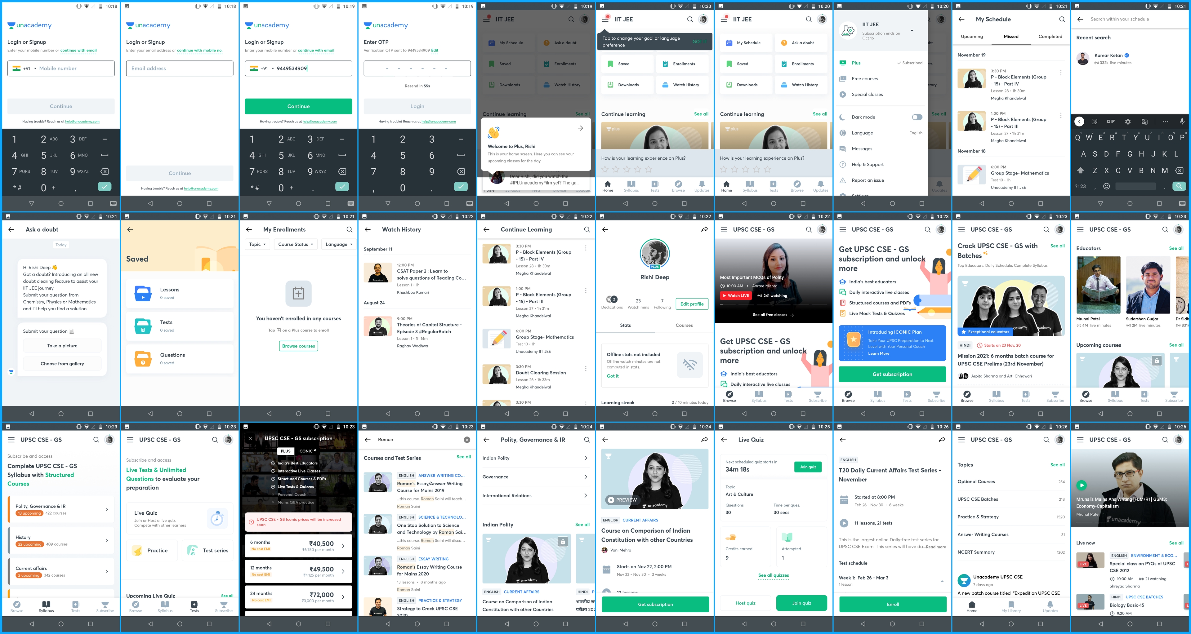
before redesign - before the redesign, we tackled a range of features like ask a doubt, live quizzes, and a/b experiments to refine our funnels. soon, it became clear that the existing app structure couldn't support the scale of upcoming features we envisioned. this realisation prompted the need for a comprehensive redesign to accommodate our future plans and enhance scalability.
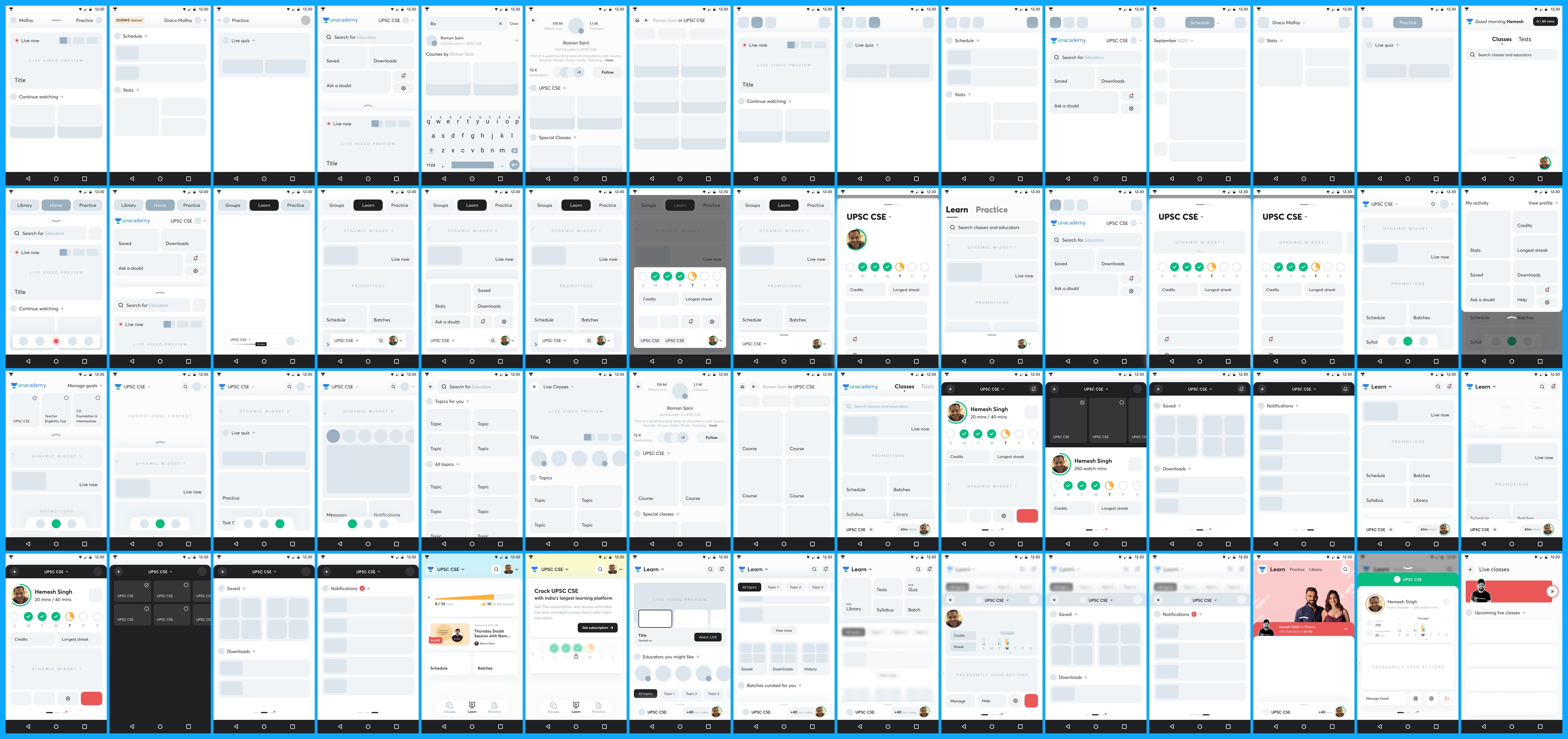
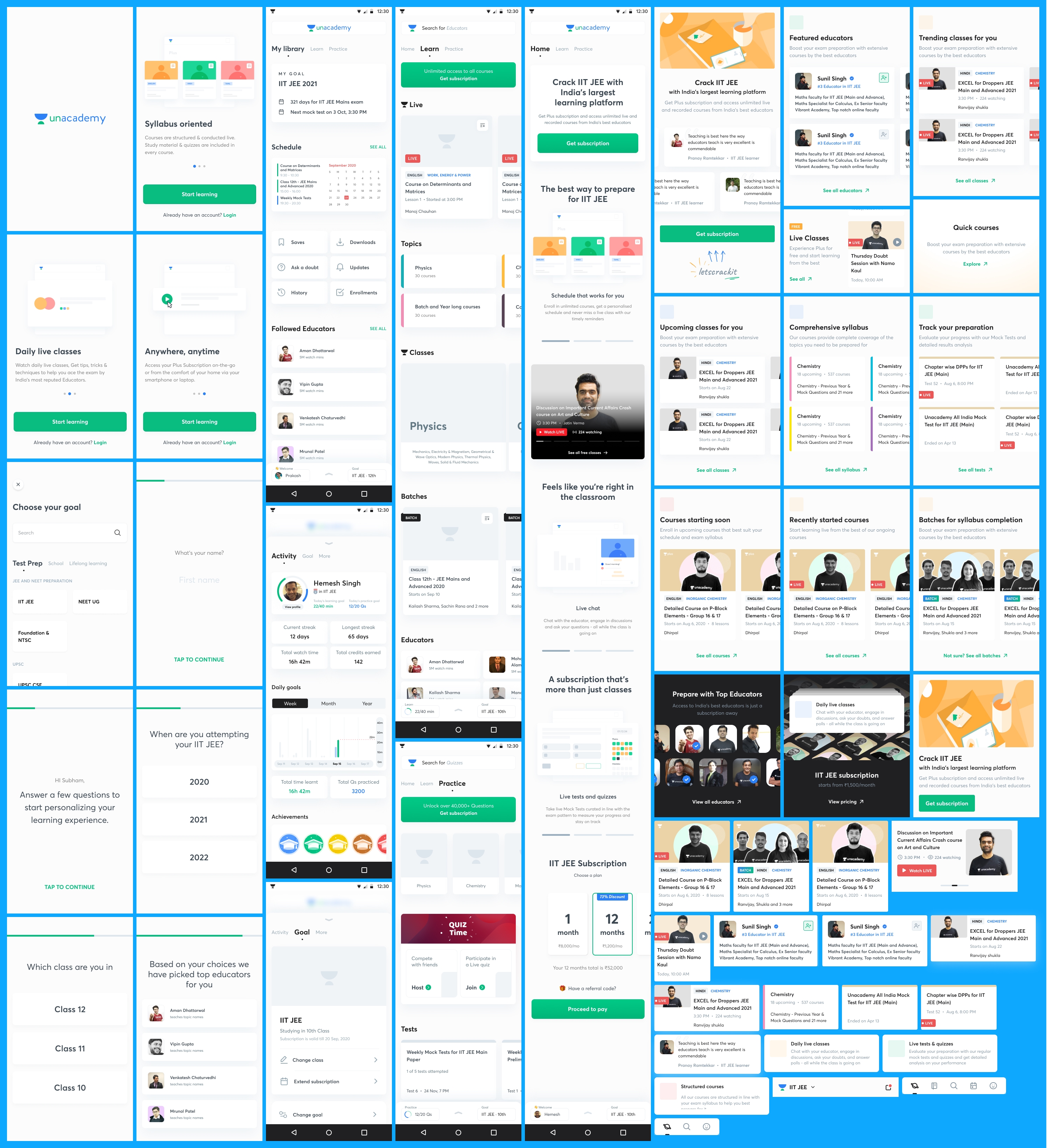
zenith - our first attempt to redesign was exploring diverse directions, focusing on user experience and interaction design. we developed concepts to address known issues and prototyped interactions for potential solutions. embracing the challenge, we aimed to introduce fresh interactions and user experience elements, infusing digital education with fun and modernity. core interactions included swipes, drags, and sheet-based elements. by rethinking the information architecture, we aimed to categorise features effectively, simplifying navigation and enhancing the overall learning journey for our users.
web to app - our second attempt, we focused on aligning the app's design with the new visual language of the web interface. by integrating the color schemes and subtle design elements, we brought the app closer to our overarching brand language, ensuring a cohesive and recognisable identity across all platforms.
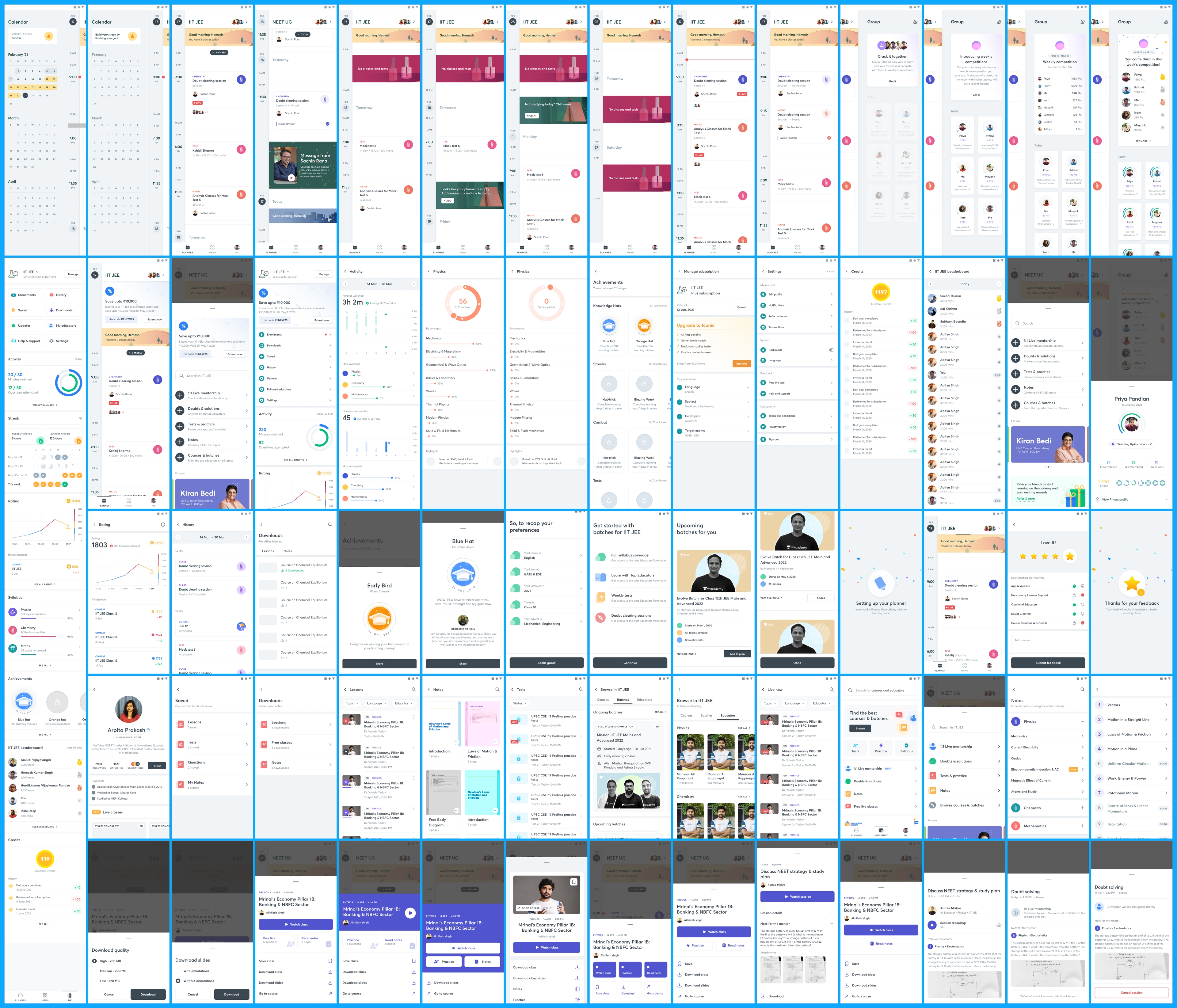
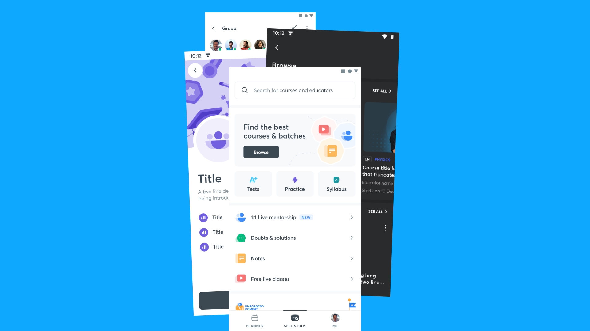
redesign - after the zenith project, we solidified our approach and refined the new information architecture for the unacademy app. our revamped layout began with the 'planner' tab, showing a calendar view of upcoming classes from enrolled courses and batches, helping learners plan their day and anticipate upcoming classes. the planner's top card greets learners with daily class and test stats, encouraging engagement and planning. swiping right on the planner reveals a full calendar for date-specific class searches. the second tab, 'self-study', consolidates all non-live resources like mentorship, doubts, tests, and notes. the third tab focuses on the learner's profile and their stats, while a left swipe on the planner unveils 'groups' for learner interactions and updates. this overhaul was driven by the need to streamline the growing complexity of our feature-rich app, as our research showed users struggling to navigate and discover content. committed to enhancing the experience for our 600,000+ daily users, we developed a new app with a clear ui framework, a design system of over 400 components, and a focus on simplifying daily educational tasks. by categorising user needs into daily activities, self-paced learning, and progress tracking, we created an intuitive and effective learning environment. these improvements not only enhance user experience but also set the stage for further personalised and effective learning features.
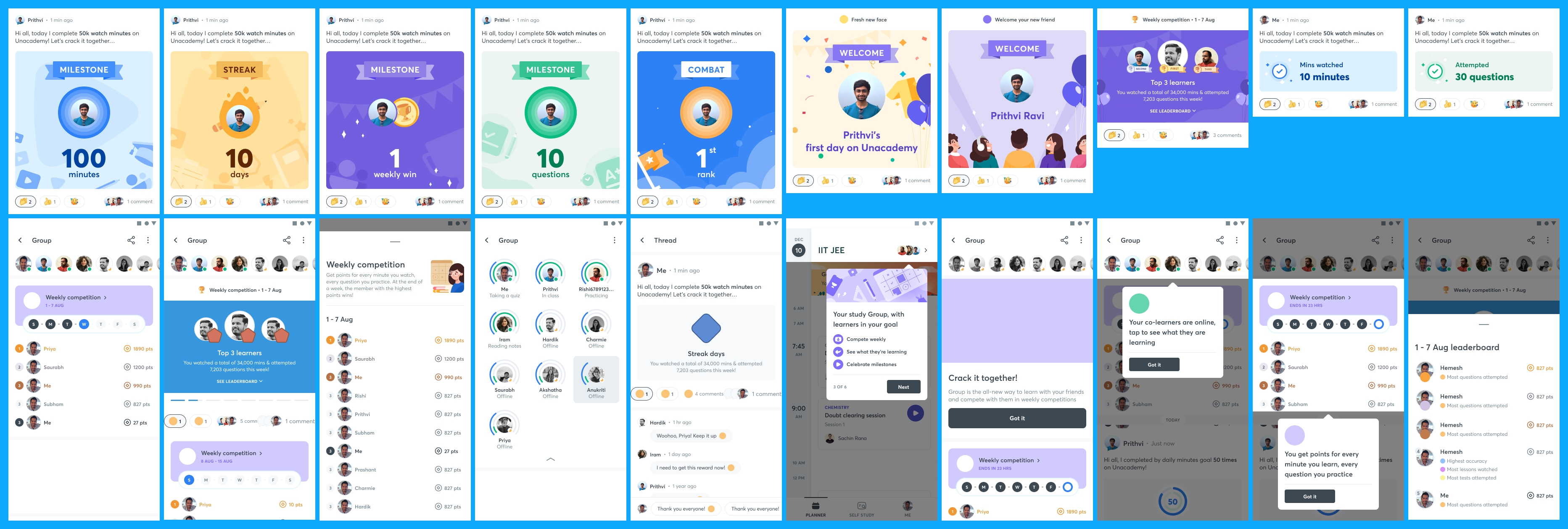
groups - post redesign, we significantly enhanced the 'groups' feature, recognising its importance in learner engagement. groups transformed into a full-fledged, immersive experience. we introduced statuses, allowing learners to see who's online and their current activities, whether attending live classes or taking tests. this addition spurred a competitive spirit among learners, leading to a notable surge in engagement. milestones and achievements of group members were celebrated through a dynamic feed, encouraging interaction and camaraderie. learners could now congratulate each other on milestones, adding a layer of community support and recognition. this played a pivotal role in sustaining motivation in the online learning journey, successfully creating over 200,000 groups, with about 100,000 comments and 460,000 reactions, enhancing the overall engagement and collaborative spirit among learners.