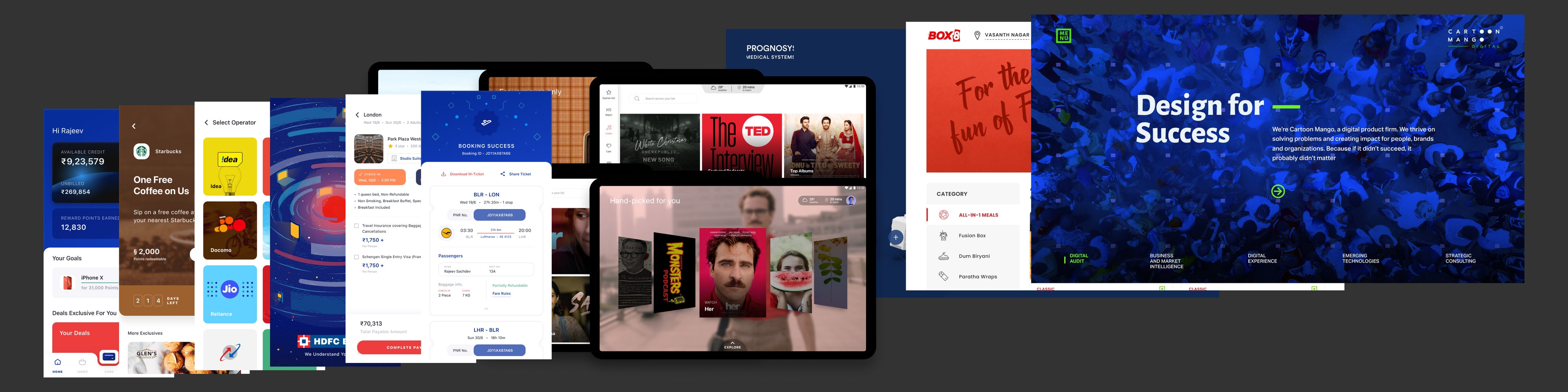
cartoon mango
2018 - 19
what - while at cartoon mango, i delved into a variety of projects across sectors like fintech, transportation, sports, and foodtech, among others. i'm now sharing some open files for a glimpse into this diverse range of work and the experiences i gained. a heads-up: some design elements in these files may appear disjointed as they were originally created in sketch and later imported into figma. various fonts from adobe and other sources were used, which might affect how these designs are displayed.
hdfc credsmart - a client approached us to develop a concept pitch for hdfc bank, aimed at creating 'credsmart,' an exclusive app for privileged credit card holders. the app's core idea was to highlight the elite perks of the most premium credit cards - like bill payments, hotel and flight bookings using credit points, along with other exclusive benefits. our design approach was to integrate hdfc's branding with a modern twist, elevating it above the conventional bank app designs. we introduced various elements to infuse a 'wow' factor, transforming mundane banking tasks into a seamless and enjoyable experience. features such as easy bill payments, shopping, entertainment, and travel bookings were designed to be user-friendly and visually appealing, significantly enhancing the overall user experience.
mahindra glyde - the concept behind glyde was to enhance the in-cab experience for passengers traveling from point a to b. collaborating with mahindra, which was venturing into the cab service business, we dedicated months to developing a comprehensive mobile app for booking rides, along with an ipad app for the in-car experience. upon entering the cab, passengers are greeted and assisted in choosing how they want to spend their commute. the range of services includes watching movies, listening to music, reading, playing games, and even jotting down notes for an upcoming meeting. at the end of the ride, passengers are pleasantly seen off, completing a journey that's about more than just travel, but an enjoyable and productive experience.
crictec - had the opportunity to make a significant impact in the massive world of sports, cricket. we designed an app that provided live scores for ongoing matches, along with deep analysis and in-depth news articles. for live matches, the app featured detailed stats including scorecards, ball-by-ball commentary, and a fantasy board. we added a visual element that highlighted the winning team, enhancing the user experience. the top card of the app was a hub of live information, showcasing the current batsmen, the bowler, and the runs scored ball-by-ball, keeping fans fully immersed in the game's action.
wally - a client from the middle east approached us to create a sophisticated expense tracker. our design focused on presenting users with a comprehensive view of their current expenses, budget, and insightful analytics on spending patterns. we incorporated in-depth graphs detailing various accounts and spending locations. the app allowed for tagging credit card expenses and offered a separate section for corporate expenditures. a calendar view was integrated to track the timing of expenses, and features like notes, lists, and documents were added for detailed record-keeping of each transaction. we also included a chat interface for users to collaborate with colleagues and discuss expenditures. to further enhance the app, we introduced a unique transaction calculator, capable of handling multiple currencies and tagging locations and other relevant details, streamlining the process of managing and understanding expenses.
prognosys - for prognosys medical solutions, we crafted a landing page designed to showcase their product and attract potential clients. the page featured a sleek, modern aesthetic, with an interactive 3D model of their product at its heart. users could engage with the model, rotating it and clicking on specific parts to learn more. we used contemporary fonts and large image sections to vividly display the product in action, creating an immersive and informative experience for visitors. this approach not only highlighted the product's features but also aligned with the innovative nature of prognosys medical solutions.
vijay raja - had the chance to design an app for vijay raja, focusing on booking affordable properties. our exploration in ux design revolved around presenting comprehensive details about each property and streamlining the booking process. the app provided immediate access to crucial information such as pricing, floor plans, vastu compliance, area size, and floor details. this design approach ensured that all necessary data was readily available to users, simplifying their decision-making process for property bookings.
adobe marketplace acceleration - adobe contacted us for a concise project aligned with an event, where they required a web app designed for a food delivery service. the app featured a variety of restaurants and cuisines, offering users a broad selection of food options. key functionalities included a search feature to easily find specific foods or restaurants, and a straightforward cart-to-checkout process. we also developed a responsive version of the app to ensure a seamless user experience across different devices, catering to the dynamic needs of users who order on the go. this design aimed to provide a smooth, efficient, and enjoyable food ordering journey.
adobe normative messaging - adobe approached us for a short-term project centered around an event, where they needed us to design a web app for an ecommerce platform, specifically tailored for smartphone purchases. our design included a detailed list view showcasing various smartphones, allowing users to easily browse through different models. each phone had a dedicated detail page, providing in-depth information about its specs, user reviews, and an easy 'add to cart' option. this setup was aimed at creating a user-friendly and informative shopping experience, focusing on simplicity and clarity in presenting smartphone choices and their details.
pick 11 - the project involved designing a fantasy sports app, where users can craft their own teams and compete to win money. the app features a list of current contests, alongside options to view and manage the teams they've joined or created. team creation is categorised into roles like wicketkeeper, batsman, all-rounder, and bowler, but we added a creative twist to the UI. this twist made the player selection process more engaging by visually representing a real cricket pitch, allowing users to vividly imagine their team's setup. in the settings section, users can manage basic details and handle transactions, including adding or withdrawing money, ensuring a comprehensive and user-friendly experience in the world of fantasy sports.
box8 - box8 approached us for a revamp of their web presence. our approach centered on modernising the design and emphasising their food items to boost order numbers. we paid special attention to their '8pass' feature, ensuring it remained a focal point. additionally, we integrated a popup feature for add-ons and other options, enhancing the user experience and streamlining the ordering process. this redesign aimed to not only refresh box8's online look but also to make the process of exploring and ordering their offerings more intuitive and appealing.
wibmo - we collaborated with wibmo to develop several dashboards for their acs product, a tool focused on managing bank transactions. the dashboard displayed key metrics such as the total number of transactions, success rates, and amounts spent. it also provided insights into top merchants and transaction locations. our design included various graphs offering deeper analysis, like transactional trends, device usage, card types, and other relevant data. this project aimed to present complex financial information in an accessible and visually appealing manner, enhancing the usability and understanding of wibmo's product for its users.
cartoon mango digital - after working on numerous projects across various sectors, we realised it was time to revamp our company's website to better showcase our diverse portfolio. the goal was to infuse new life into the visuals, sparking interest and curiosity. we achieved this by uniquely positioning visual elements, creating a 'wow' factor that set us apart. our approach to navigation was reimagined, focusing on creating a visually delightful experience that not only highlighted our work but also attracted more clients. this redesign was a step towards reflecting our growth and the breadth of our capabilities, capturing the essence of our creativity and expertise in a fresh, engaging way.